Design Blunder? Brussels Airlines Unveils New Livery And Branding
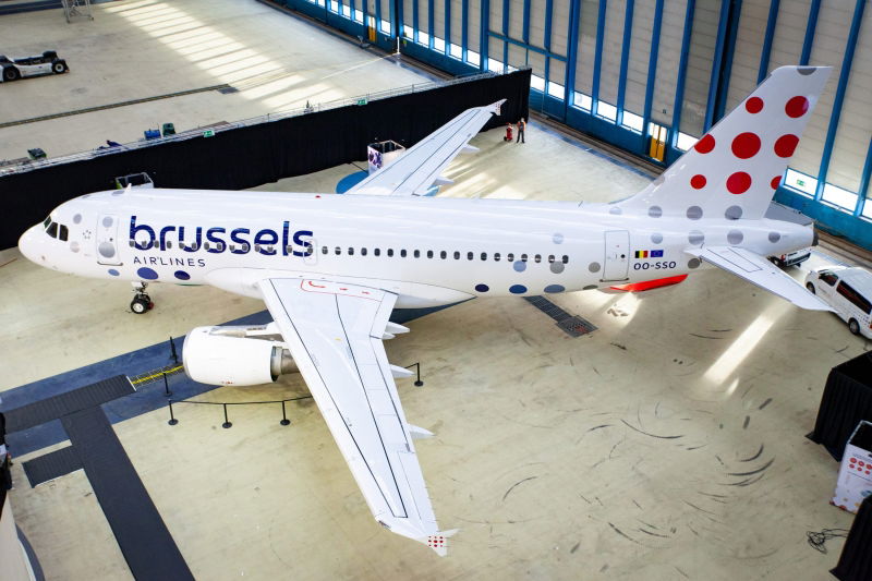
Belgium’s home carrier Brussels Airlines has unveiled its new brand identity and livery as part of its plan to “confirm its position” as the country’s home carrier.
The Lufthansa Group subsidiary has decided to rebrand as part of its ongoing plans to improve its operations by providing improved customer experience, new technologies, digitization, new ways of working, and the development of its employees. Like many other airlines, they are also re-focusing on making profits rather than holding on by a thread after the COVID-19 pandemic, and have plans to reduce their ecological footprint in line with becoming more environmentally friendly.
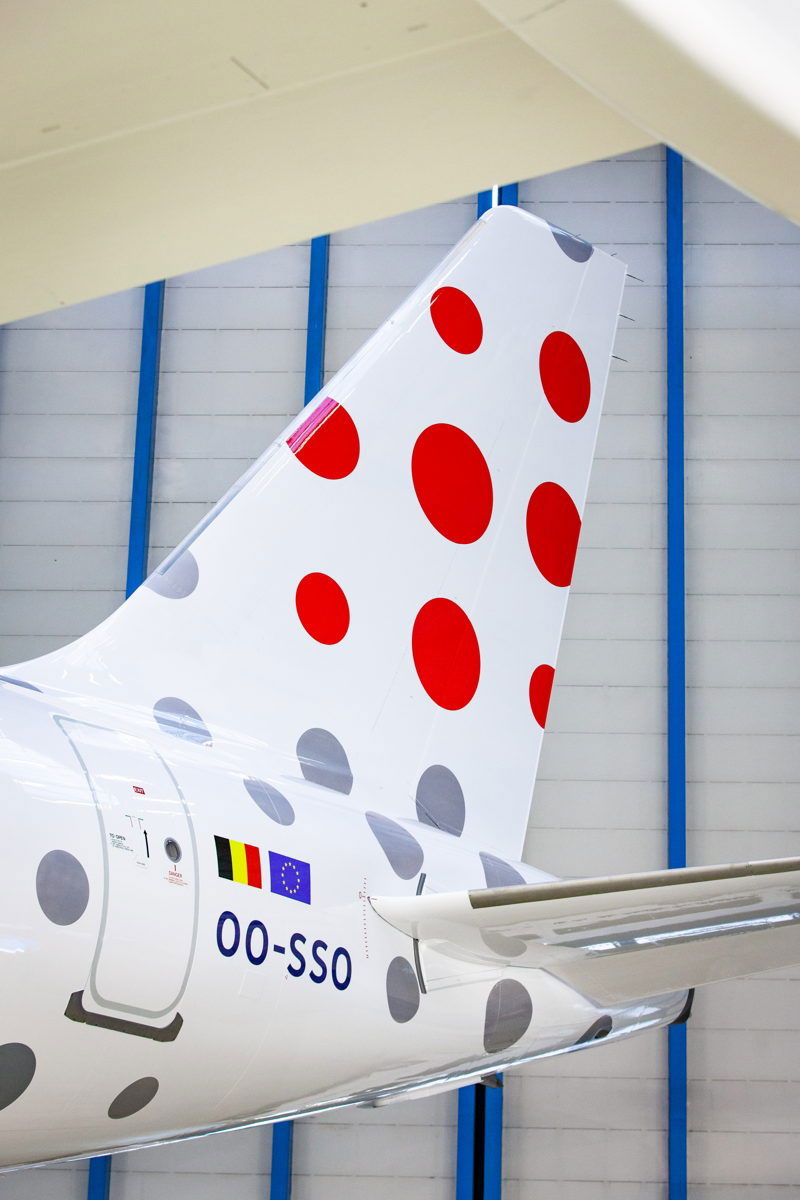
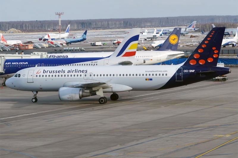
From a design standpoint, they moved away from the blue tail with the dotted ‘b’ towards a simplified series of differently sized red and gray dots across the tail and rear fuselage, along with updated fonts for the blue ‘brussels AIRLINES’ text logo at the front. There are more blue and gray dots on the front section of the aircraft as well. The nine dots on the tail (not represented well on the A319) are of different sizes in the form of a square, each representing some form of diversity of its customers, its destinations and its employees.
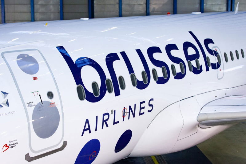
“We want to clearly mark the start of the New Brussels Airlines. For our customers, who deserve the best, but also for our employees, who are committed to the transformation that we’re pushing forward and to which they contribute every day. That is why today we present the visual translation of our new start. With this new brand identity, we are ready to show our customers, our employees, our partners and all other stakeholders that we are turning a page. As one of the four Lufthansa Group network airlines, we are building the way towards a promising future. We see this new brand identity as a symbol of confidence in our company, re-emphasizing our identity as Belgium’s home carrier.” – Peter Gerber, CEO of Brussels Airlines
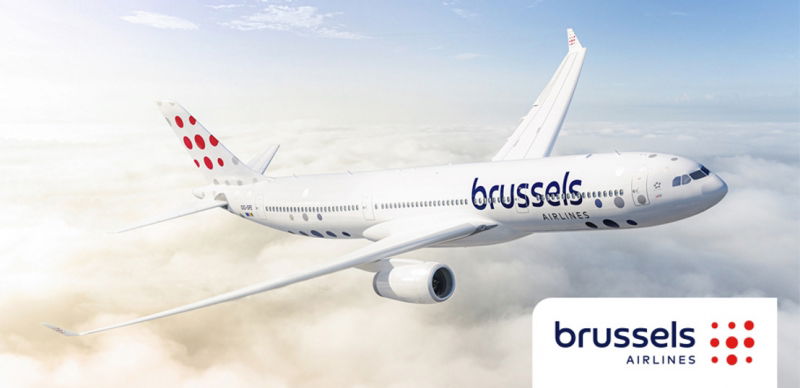
Throughout the release, the various heads spoke about evolution and re-affirmation of being the country’s national airline, but it is unclear as to how exactly they plan to realize these goals, and what they plan to do to differentiate themselves versus any other main line carrier. From a hard product standpoint, they plan to update their branding, refresh their cabins and introduce 3 Airbus A320neos from 2023, along with other minor technological improvements.
For reference, here is the livery Brussels will be moving away from.
About the branding/livery?
From a totally insular perspective, while the livery utilizes a bit too much white space, it’s still is a bit fun and in line with the modern/minimalist liveries of today. However when you consider the airline’s intended market position, the design does not really fit in line with that, and might be better suited for a low cost airline.
I can’t but help wonder if the designers were uninspired (or inspired by the wrong country), but at first glance, you can’t help but think about Croatia Airlines’ own livery. Brussels’ old livery is still easily recognizable, but my guess is onlookers may now have to do a double take to ensure they’re not confusing the aircraft with a Croatian tail. All in all, this seems to be yet another case of an airline using a cookie cutter template as part of their rebrand. Just ask Lufthansa.

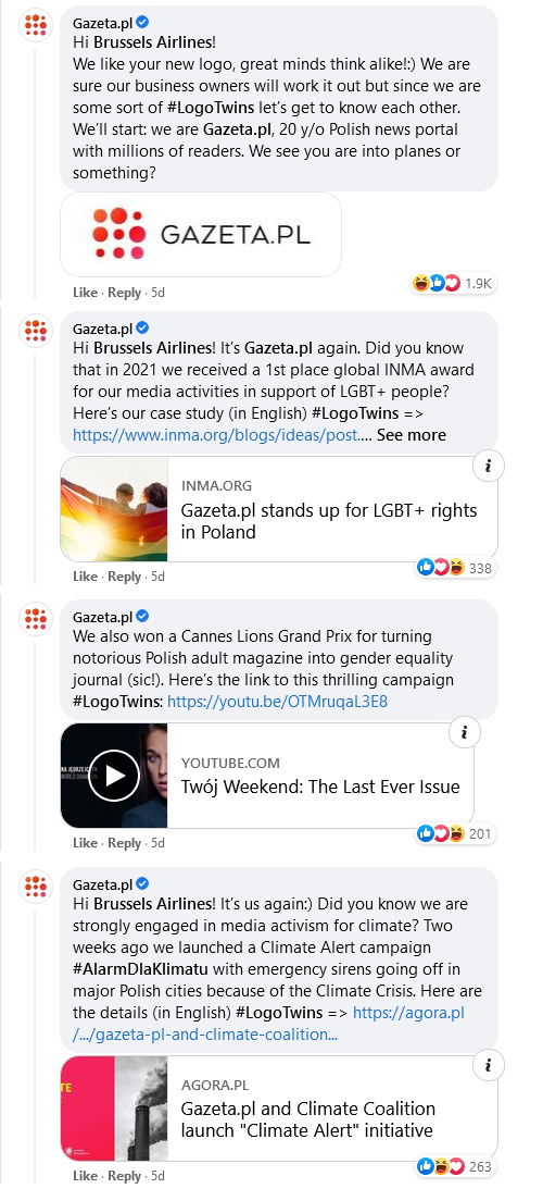
The Polish ‘inspiration’ does not stop there as newspaper Gazeta.pl came with guns blazing, highlighting the visual similarities and representations in the airline’s logo and the one used by the newspaper. They even used the hashtag #LogoTwins to make fun of the situation.
